Good for Ken! See Mr Shuttleworth’s contribution under the title of Glass Ceiling on the BBC.
So is the tide turning with people beginning to see beyond the brash salesman portrayal of all-glass buildings as sexy. After all they have no more technical foundation than most passing fashions. For too long soft pseudo ‘facts’ have been used as ‘Emperor’s New Clothes’ to support the unsupportable. Hard facts are needed to illustrate how draft it now is – yet inconvenient real facts for a real evidence base is plainly not sexy enough.
Do not get me wrong, daylight is good for you – but too much of a good thing almost always becomes not so good. Take food vs obesity as an example. The occasional glass of red wine is another one. Daylight is just the same. Deprive yourself of daylight and your health suffers. But too much and the sunshades and sunhat have to come out and ability of the brain to concentrate evaporates. Fine for the right time and place. But it is interesting insight that our eyes’ optimum daylight for concentration seem to reflect an evolutionary history as cave dwellers and foraging under heavy tree cover!
So some hard facts:
Our eyes recognise a room as well lit with daylight levels of typically between 2% and 5% of the outdoor illumination levels under an overcast cloudy day (ref: British Standard 8206-2). Direct sunlight is typically 10 fold more intense than this overcast sky!
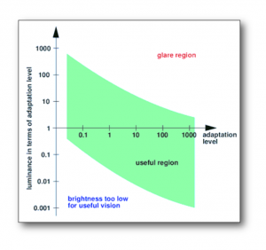
Good daylight is far more than ‘Quantity’ of daylight. Glare is also a key determinant of visual comfort / avoidance of visual disability. Too much contrast glare between bright and shade and the eye cannot cope. If indoors’ is at 2-5% of outdoor lighting levels then by definition the contrast between them is some 50 and 20 times. Viewing through a window illustrates the challenge the eye has to cope with. To put this into perspective the ideal maximum contrast should be no more than about x4 for more exacting tasks like comfortable reading.
For our eyes, contrast glare greatly increasing as the light source comes closer to horizontal line of sight. If greater daylight is pushed deeper into a room using larger windows, more light is travelling almost horizontal and hence increases the glare contrast between the window and what then appears relatively gloomy room surfaces. Interestingly the room surfaces may not in fact be gloomy, but because the eye tries to adapt to the main window glare source by closes its iris, it means less of the room surface illumination can enter the eye.
Energy savings are claimed for large windows. That might have been the case in the past, when artificial lighting energy use was 12, 25 or 40W/m2 (the latter being the office norm some 40 years ago and still so in some retail!). But now with high efficient LED lamp sources (eg 100 lumens/W) and task-lighting fast becoming the norm, lighting energy use is heading for 5W/m2. Hence the energy to be saved is a fraction of what historically it was when big windows started to become in vogue.
Glare blinds are advocated to block this glare from large windows. But blinds also block the daylight – is this not self-evidently self-defeating? Besides, as glare varies with type, position and direction at each point in the room there is no single all-inclusive definition of when glare will be a problem. It is one of those ‘too difficult to solve’ challenges. Veiled glare, for example, may occur when a brightly lit object is seen as a reflection on say a computer screen – almost irrespective of window direction. Manual glare blinds seek to address this inability of automatic blinds to predict all glare types. However, while the human being may well have an instinct to alleviate discomfort and hence lower the blinds, it does not have a similar instinct to reset the blind after the glare source has moved on. The result is blinds down and lights left on.
Large window advocates continue to point to measured artificial lighting energy use consistently being higher than predicted. What they do not explain is that their daylight factor calculation predictions assume a nice empty room for daylight penetration. The in-use practice is very different with cluttered desktops and screens blocking most of the daylight. So bang goes those theoretical energy savings.
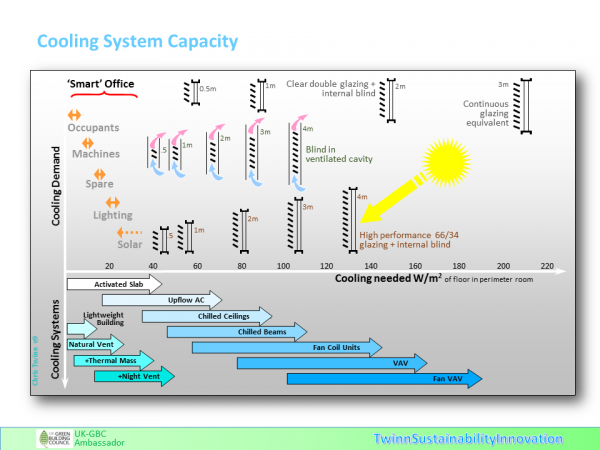
In reality all the indicators are fundamentally moving away from full height glazing. In a modern ‘Smart Office’ it is not only the artificial lighting energy use that is going down. Tablet computers (eg USB peak 4W charge rates) with flat screens are now using less than 5 W/m2 of energy instead of convention numbers of 15 – 25 W/m2. The diagram below illustrates the ever increasing impact the window size has on your choice of air-conditioning system. Your window cooling load is now easily 75% of your room cooling capacity. And typically your glazed wall corner office will have even greater cooling needs than those shown. It is this peak capacity that defines the air-conditioning capacity and systems type – which is then rolled out cross all you building. Immediately your plant costs are significantly higher than they need to be, as is the consequential annual energy use.
So what of the alternative? Well first of all I should start by saying that if someone really wants an all glass building then they are fully at liberty to completely cover their building in it. My main focus though, is on making that part of the façade that is transparent (or partly) more appropriate based on hard fact real needs.
With Smart Office low artificial lighting energy needs means the daylight/cooling/heating optimum window area reduces to perhaps 25-35% of the façade area instead of 75%-95%. The low energy Smart IT also mean that the façade thermal insulation is needed as the buildings are no longer ‘self-heating’ using inefficient lighting/IT. More modest windows help here too because wall insulation is still about 5-10 times better than best glass.
As an interesting aside it means more convergence with residential envelope energy design – which is probably a good thing given our planning system now allows building use changes between offices and residential!
So the window design now focuses on ‘Quality’ of daylight and not delivering just ‘Quantity’ as if it were a simple opening in a wall. The window shape, orientation, reveals should be chosen with an emphasis on making the room feeling welcoming with well-lit surfaces while not forcing the eye to adjust to overbearingly large window glare sources. It is interesting that emerging research is showing occupants tend to judge whether to switch on their task lights based on general room surface illumination perception and not the amount of illumination on the desk top!
With regard to the view, I recall research back in the 1980’s that found that the brain fills in the view beyond a series of discrete window openings. The key issue was then to provide an element of foreground and sky to complement the distant mid-level view so the brain had sufficient data for this wider view perception. Perhaps after all the Victorians, with their vertical orientated windows, were on to something!
What is also interesting is the way these smaller loads (solar, lighting and Smart IT) allow more passive systems to meet the peak cooling needs. Without needing the galvanised tin boxes and dropped ceiling, permits less storey height and reduced cladding costs – as well as less useful floor area lost to mechanical and electrical equipment rooms. It almost goes without saying that less extravagant windows also avoid the costs of external blinds or shading. Indications are of overall capital costs reductions for the right windows of as much as 20% less compared with the all glass alternative!
As an aside this also opens up a lot of pre-1980’s buildings as being far more compatible with today’s low energy needs than is normally appreciated, and hence ripe and appropriate for refurbishment!
Surely a return to hard facts based evidence and common sense over the all-glass fashion eco-trip is well overdue.
Chris
28May14
